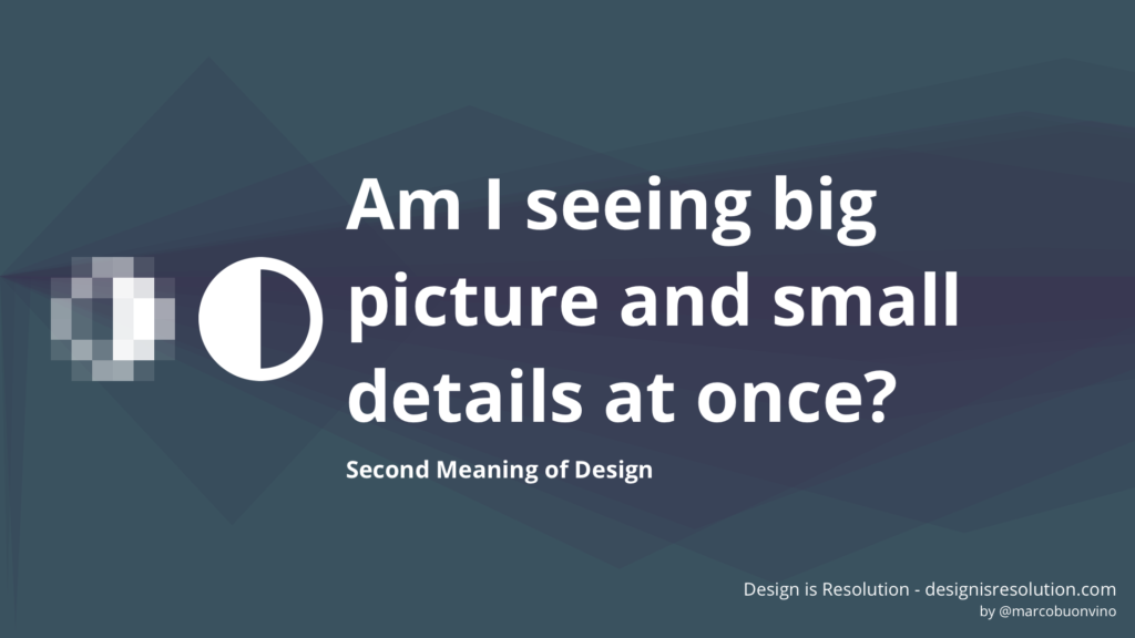
The Second Meaning of Design is being able to switch between different points of view.

Big picture or small details? High fidelity or rough illustration? Vision or execution?
Choosing the right distance is crucial for the success of a project.
Start designing without a vision and you’ll soon get feasibility problems and negative feedback from future users of your product or service. Indulge too much on the vision and you’ll never make it real, losing momentum or grip on the market.
You’ll need to switch quickly between different points of view: this ability allows you to change Resolution while you’re designing.
If a good designer can view many sides of a problem simultaneously, a great designer is able to find new ways to look at problems, fostering pains, gains and solutions.
“That’s great — you may say — but how do you actually bring a change of view in a project?”
“Show, don’t tell”, I answer.
The most peculiar skill of a designer is the ability to illustrate an idea, in order to create alignment.
It can be a journey map, a service blueprint, a simple sketch, a wireframe or a detailed interactive mockup. There are so many deliverables out there.
Before starting your best concentration playlist and jump in the design activity, you first need to decide which kind of Resolution you’ll use.
The truth is that you’ll hardly need a super time-consuming pixel perfect deliverable. In most cases, you’ll need to fake it just enough.

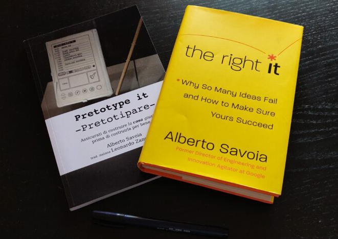
I recently encountered the concept of Pretotyping (…yes, you read it right).

The basic idea of Pretotyping is to:
- Define a Market Engagement Hypothesis (your key assumption)
- Create the quickest testable artifact (the Pretotype) to validate the hypothesis.
- Involve potential customers in order to to collect significant data (leads, subscription to newsletters, purchases, etc…)
- Use the smallest/nearest /cheapest environment (your building, your neighbourhood, your office, that shop near home, etc… ).
And when I say “quickest artifact”, I really mean it.
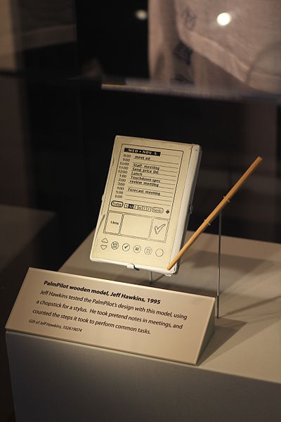
A Pretotype can be just a simple piece of paper, an email or a piece of wood. It’s just what it takes to test your idea.

My own experience of Pretotyping (spoiler: it was awesome!)
I tried to introduce the Pretoyping mindset in my everyday work. What I got for a result was a deep change of Resolution.
And it wasn’t just for me!
The entire team was able to see the core idea from many different perspectives.
Having a visual illustration of what normally is just written in business requirements (a wonderful plain word document) was a radical change in how projects are usually approached.
Every department, from IT to Communication and Branding, was suddenly able to focus on the overall idea instead of just the details of their peculiar silo.
The Pretotype was then shown to intended future users, so we collected evidences and adjusted the design. It simply never happened before that the design was tested before the detailed design phase occurred.
The team was able to discuss the business idea, the feasibility and the roadmap without encoutering the usual resistances.
All thanks to a simple Pretotype!
The difficult part? Bring the Change, obviously.
Hm. Actually this Pretotyping story isn’t a major revelation, after all.
If you took anything like a basic course of Design Thinking, any instructor will say that early testing with final users is a key aspect to validate the initial assumptions of a concept.
It is how you apply this in the organization, allowing a change of Resolution while watching the idea. This may be easily be the most difficult part.
If I may give you a little piece of advice, I’d say this:
Design to allow even others to see things from different points of view, thus changing Resolution.
Show. Illustrate. Let them try in first person. Let them live the Second Meaning.
You’ll get a committed team who will also act as a promoter of your idea.

